

Selecting the right color palette for your home is more than a matter of aesthetics—it’s about shaping the atmosphere, influencing mood, and creating harmony throughout your space. Colors have a profound impact on how rooms feel and function. A well-chosen palette can make a small room appear larger, turn a plain area into a welcoming retreat, and even affect your energy levels. Understanding how to approach this process ensures that your home reflects both beauty and comfort.
Understand the Basics of Color Theory
Before you begin painting or buying décor, it’s essential to understand how colors interact. Color theory helps explain why certain combinations feel harmonious while others clash. Primary colors form the foundation, and when mixed, they create secondary and tertiary tones. Warm hues—like reds, oranges, and yellows—bring energy and a sense of intimacy, while cool colors—such as blues, greens, and purples—promote calmness and relaxation. The color wheel is an invaluable tool for seeing how shades relate to one another, guiding you toward combinations that naturally work well together.
Assess Your Home’s Lighting Conditions
Light dramatically changes how colors appear. A paint swatch that looks beige in the store might look gray in your living room. Natural light varies depending on the time of day and the direction your windows face. South-facing rooms often receive warm, intense light that enhances bright colors, while north-facing rooms may need softer or warmer tones to prevent a cold feeling. Artificial lighting adds another layer of complexity: fluorescent bulbs can make colors cooler, while incandescent lighting tends to warm them up. Testing small patches on your walls under different conditions helps you avoid surprises.
Consider the Mood and Atmosphere You Want to Create
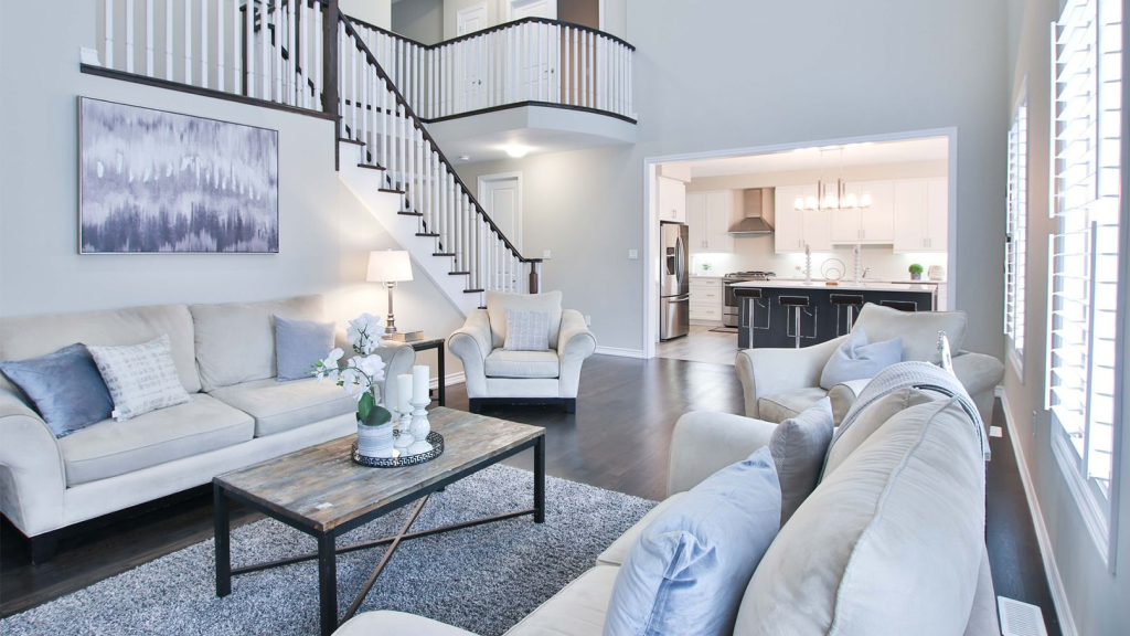
Each room has its purpose, and the color you choose should match the feeling you want to evoke. Bedrooms often benefit from soft, tranquil shades that encourage rest, while kitchens might feel more inviting with lively, fresh colors. Living rooms, where people gather, can be neutral to accommodate different moods but accented with vibrant hues to prevent the space from feeling dull. Think about how you want to feel when you step into each room and let that guide your choices.
Analyze Your Existing Décor and Architecture
Your walls are only one element of your space. Floors, furniture, fabrics, and even permanent fixtures like cabinets or fireplaces play a role in how a color looks. Consider your home’s architectural style—whether modern, rustic, or traditional—and choose colors that complement it. If your sofa or flooring already has a dominant tone, make sure your wall color enhances rather than competes with it. Cohesion between surfaces creates a polished and intentional look.
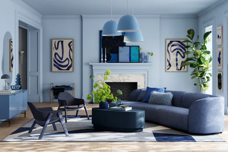
Explore Popular Color Schemes and Combinations
To simplify decision-making, many designers rely on established color schemes. Monochromatic palettes use variations of the same hue, creating a subtle and cohesive effect. Analogous schemes, which pair colors next to each other on the wheel, feel harmonious and soft, while complementary combinations—colors opposite each other—create bold, striking contrasts. The choice depends on whether you want your space to feel calm, dramatic, or energetic. Just keep in mind that balance matters; an entire home painted in intense, high-contrast colors can feel overwhelming.
Tips for Choosing Colors Room by Room
While you want each space to have its personalityf, your home should maintain a sense of visual flow. Select a base color that works well throughout common areas, and then allow individual rooms to express subtle variations or accents. For example, a neutral main hallway might transition into a soft blue bedroom, with accessories that echo similar undertones. Accent walls can highlight architectural features or create a focal point without overwhelming the space.
Tools and Resources to Help You Choose Colors
Technology has made it easier than ever to preview color palettes before committing. Many paint brands offer apps that let you upload a photo of your room and see how different shades look. Swatches and small sample cans are also invaluable because they allow you to see the real-life impact of each hue. If you feel uncertain, a short consultation with an interior designer or color specialist can prevent costly mistakes.
Common Mistakes to Avoid When Choosing a Color Palette
One of the biggest errors homeowners make is choosing paint without testing it under actual lighting conditions. Another is ignoring undertones—colors often carry subtle hints of green, blue, or pink that can clash with existing décor. Finally, avoid selecting colors based solely on current trends. While fashionable tones may look great now, they might feel dated quickly and may not match your long-term preferences.
How to Test and Finalize Your Color Palette
Once you narrow your options, paint small sections on the wall and live with them for a few days. Look at them in morning light, afternoon sun, and evening artificial light. This testing phase often reveals which shades feel right over time. If you’re still unsure, ask for second opinions from friends or family who understand your style preferences.
One List: Quick Questions to Ask Yourself Before Finalizing
- Does this color complement my existing furniture and flooring?
- How does it look under both natural and artificial lighting?
- Does it create the mood I want for this specific room?
- Will I still like this shade a few years from now?
Choosing the right color palette for your home is a thoughtful process rather than a quick decision. By understanding color theory, considering lighting, analyzing your décor, and testing shades carefully, you can create a space that feels cohesive, welcoming, and timeless. The effort you put into planning now will reward you with rooms that look beautiful and feel just right every day.